Honey Yoga Social
Honey Yoga is a yoga studio that is committed to bringing people together
through a spiritual community.
Tools
Figma, Illustrator, Photoshop
Skills
Branding, Product Design, UX/UI, Brand Research, Wireframing
Duration
8-week brand research and design
4-week app re-design
Team
Solo Project
Overview
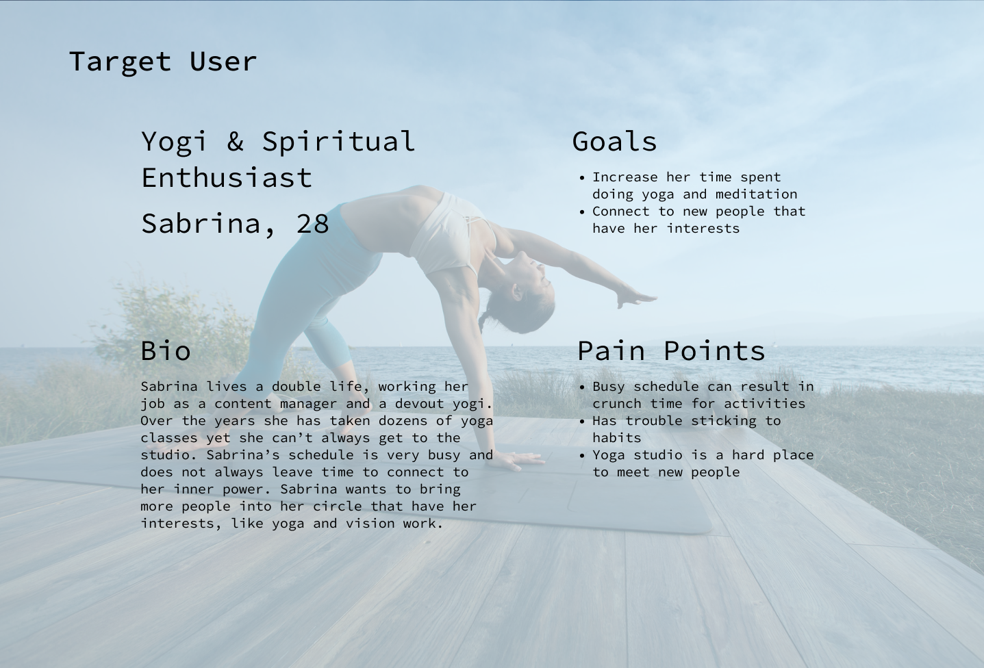
Holding metaphysical beliefs can feel lonely when one’s meditations are all alone. In a yoga studio where theres mere minutes between classes, attempting to meet new people between the mats can feel intimidating.
Honey Yoga Social wants to connect their clients to create a thriving community.
Objectives
Allow users who are busy to easily access meditation & yoga practices throughout the day.
Provide a safe space for users to connect with each other about their metaphysical beliefs.
Create a calm atmosphere that encourages enlightening thoughts and reflections on life
Branding
Logo
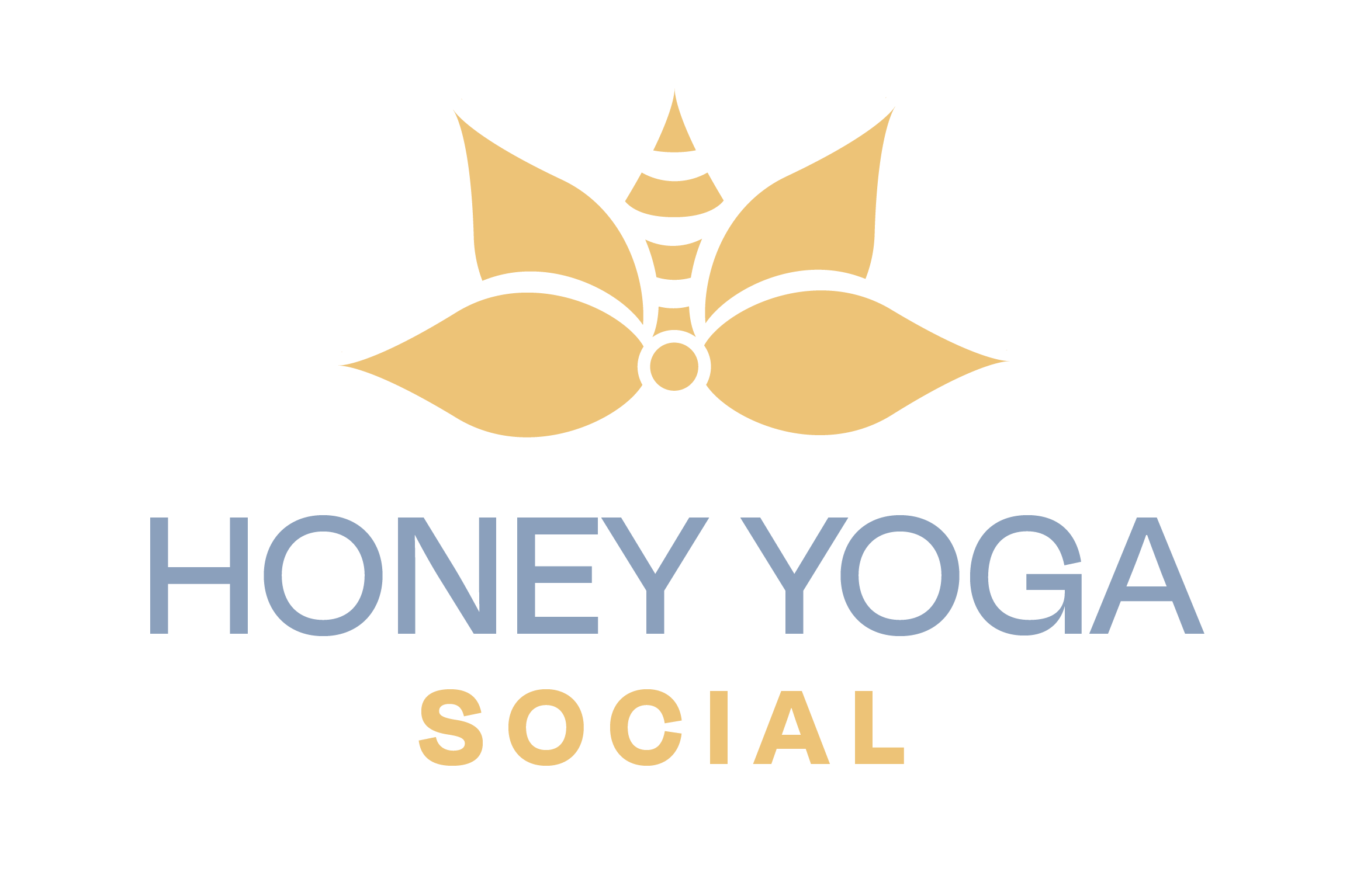
Through this re-brand the goal was to bring spirituality back into yoga by allowing social connection to thrive. I kept the name honey to invoke the community that comes from a buzzing bee-hive.
This bee helps form the trademark with a lotus flower. The lotus flower is known as a symbol of re-birth, it serves as the guiding light in the path to enlightenment. The lotus serves as Honey Yoga’s connection back to ancient roots.
Brand Assets
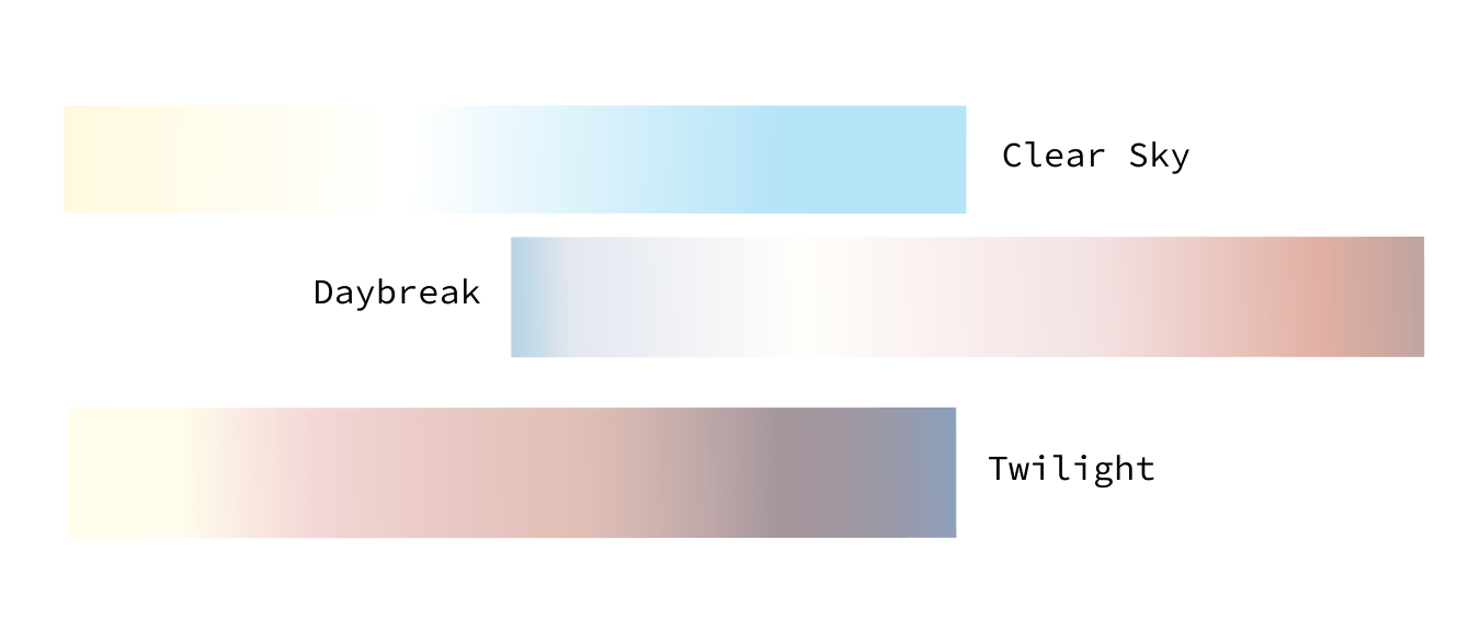
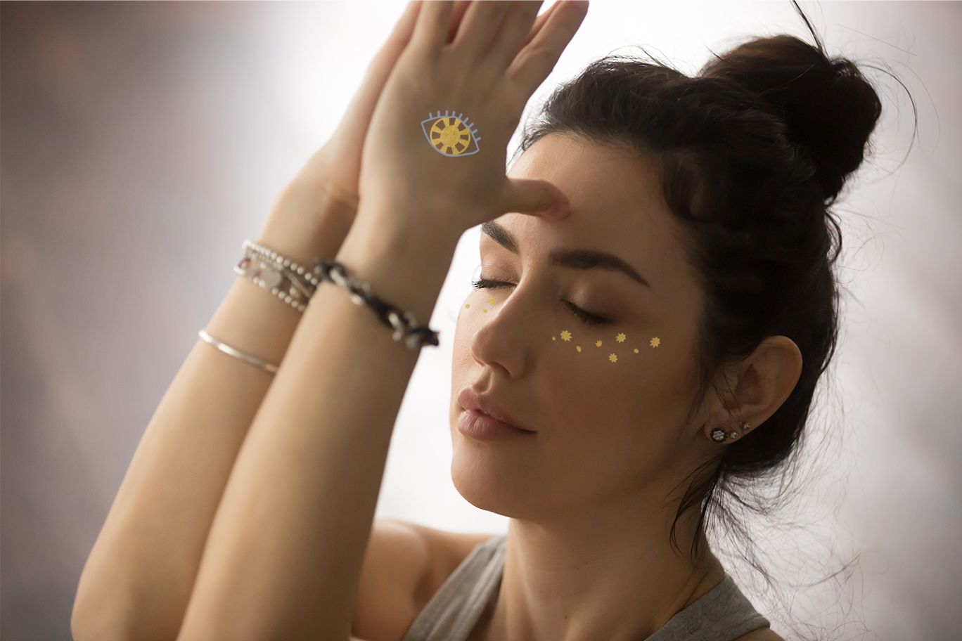
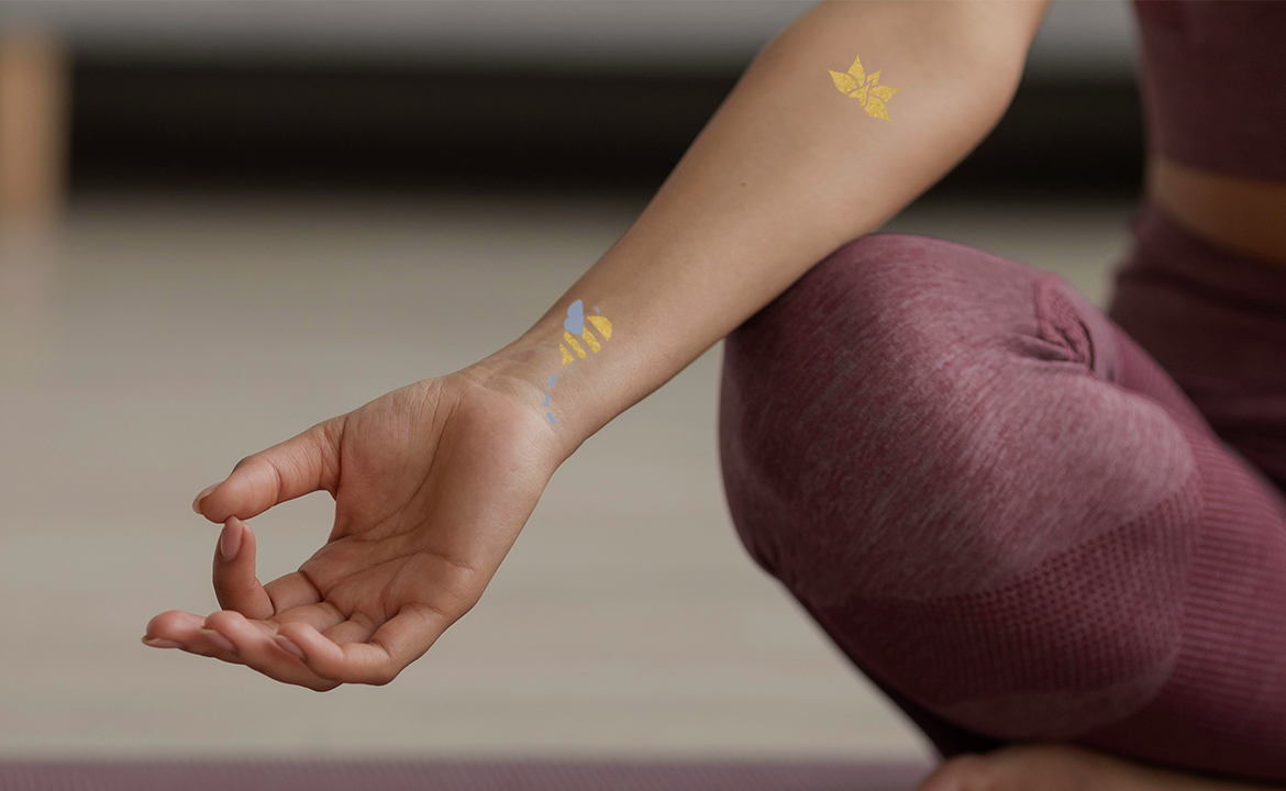
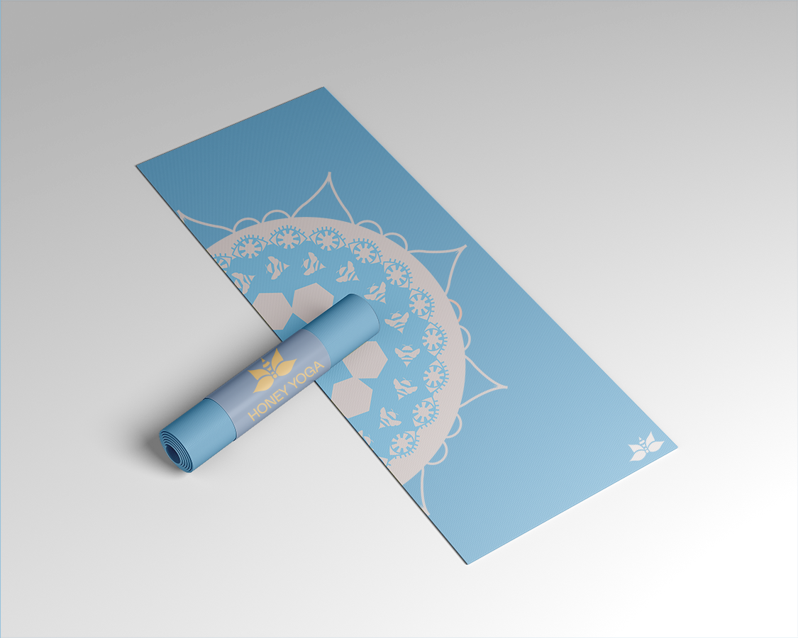
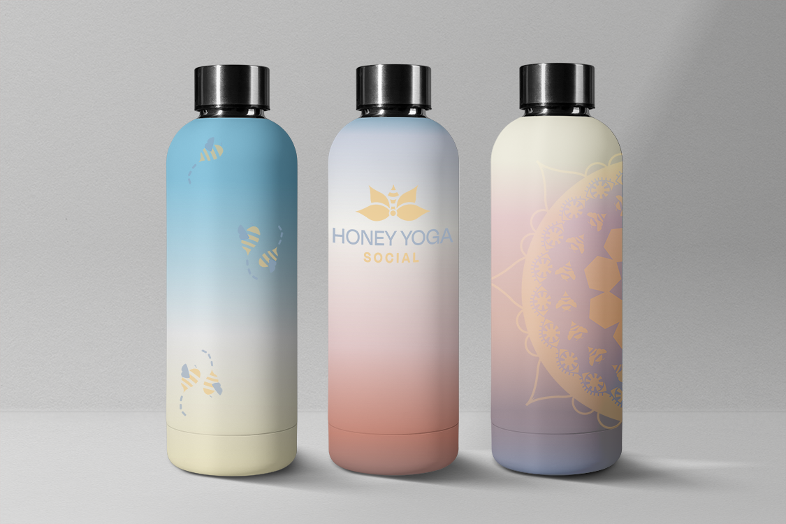
Brand Assets were created for Honey Yoga for their new catalog of social events and mixers, along with merchandise that would be available year-round. To create a buzz at social events I created flash-tattoos using bees & traditional yogic symbols. The colors of the brand mimic the sky to creating soothing gradients that evoke feelings of serenity.
Reasearch
Goal
The goal of the Honey Social app is to provide a social space for Honey Yoga’s clientele where they can discuss beyond the yoga, into the metaphysical realms of life.
The app also functions as a portal to access daily meditations and yoga practices found at Honey Yoga, through a simple interface that is made to change with your day.
Design Iterations
This app underwent two phases of iterations, The first design was in fall 2022 and the second was in spring 2023.
The re-design of this app also resulted in the re-design of the Honey Yoga brand, to ensure that the spiritual calm of the app was reiterated inside of the brand assets. There were also issues with color-accessibility which resulted in the new color pallet seen in the re-brand.
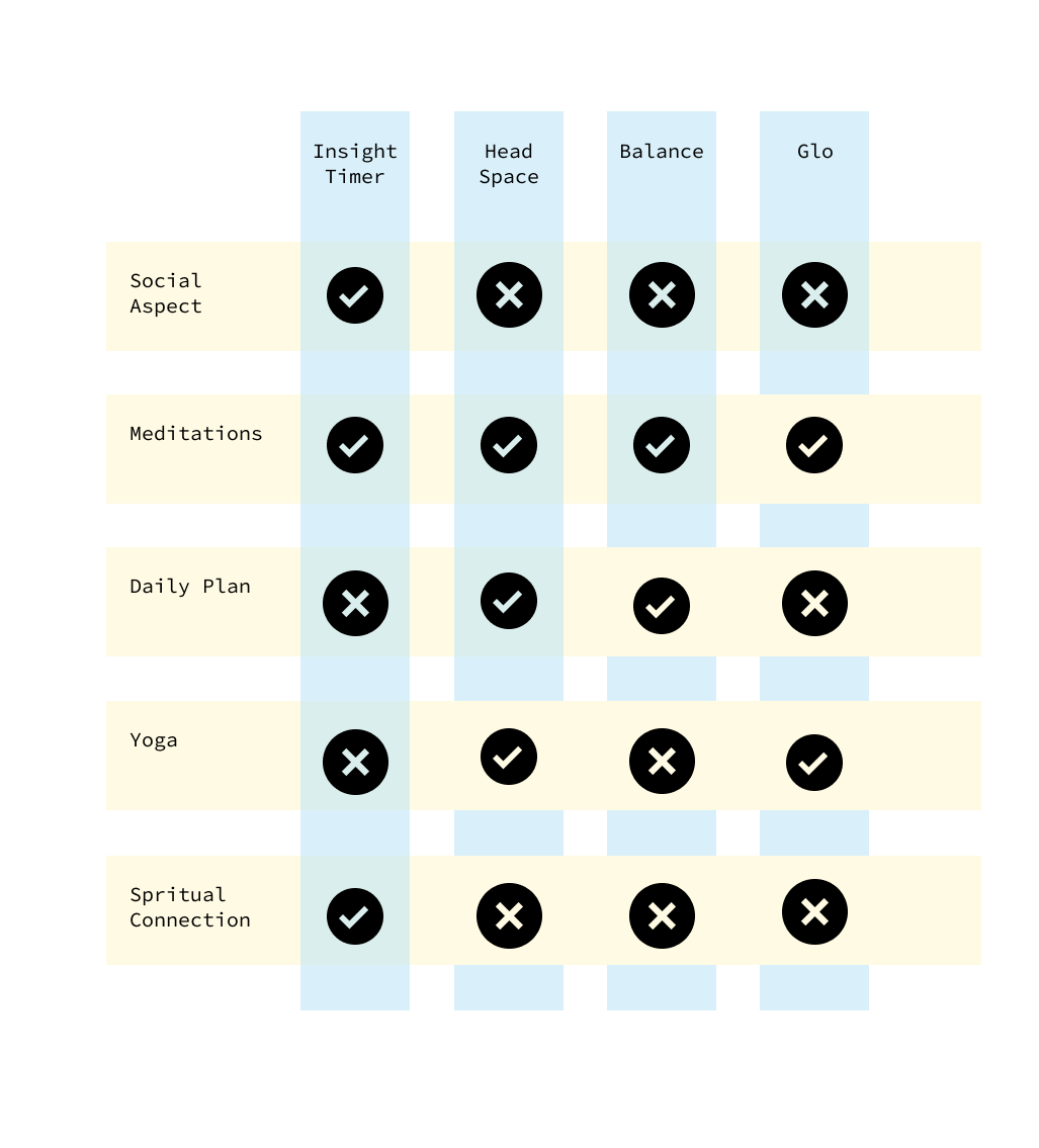
Comparative Analysis
Since most yoga studio apps only deal with scheduling or classes. I decided to broaden my analysis out to meditation and yoga apps.
Feature Prioritization
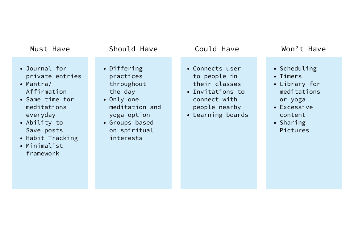
I wanted features to be a direct response to be issues presented by users. I attempted to have each feature be a solution to a users problem.
Design Process
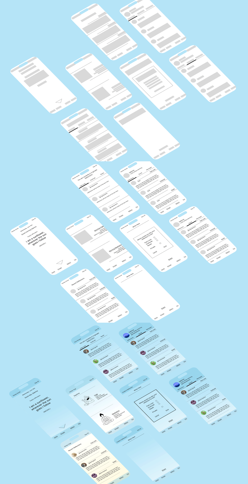
Sketches & Wireframes
When I began sketching I tried to keep feature and goals in mind. I ran the new design through user testing where users thought aloud.
Final Design
Onboarding
New Users are welcomed to the Honey Social app by a quick set-up of their goals that will result in customized groups, meditations, yogic practices and notifications.
Home Page
The user is greeted with the mantra off the day. Scrolling introduces the yoga and meditation practices related to the time of day. Further down, the feed populates.
Reflection
Posts are referred to as “reflections” to encourage users to write their deepest thoughts.
Groups
Groups are limited to three, to limit feelings of stress and indecision. Rather than users focusing on likes, users are focused on saving reflections that they enjoyed with no numbers.
Profile
Profiles work as the users journal and their saved and personal reflections can be accessed, as well as where users can message others.
Colors & Features Shift
Throughout the day the colors, meditations, and yoga practices shift related to the user’s morning, mid-day, and evening settings.
Interactive Prototype
What I learned:
This project was my first in-depth user interface design, I learned a lot about navigation and prioritizing minimalism over excessive navigation. I also learned the importance of typography in UI, I worked with the challenge of using almost purely type to define buttons rather than cluttering the interface with shapes. I found this to be my most innovative solution to my original design’s cluttered organization.
What I would do differently:
Overall I just would’ve added more detail and fully prototyped the entire app, from the videos, and audio play screens, to the chat function. When I originally came up with this concept, I did want there to be more of a connection to the physical studio, like allowing users to see who on the app they had taken yoga classes with and such. I just worried that such a feature could be overstepping privacy bounds.
