Spindrift
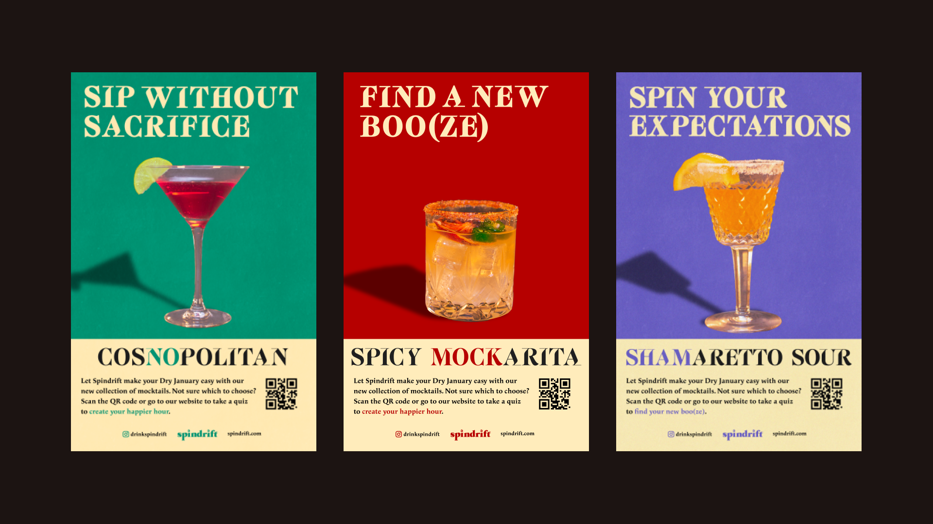
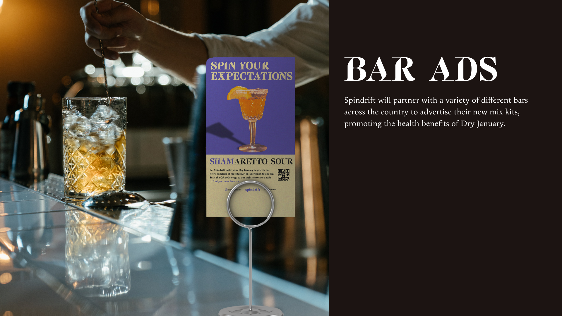
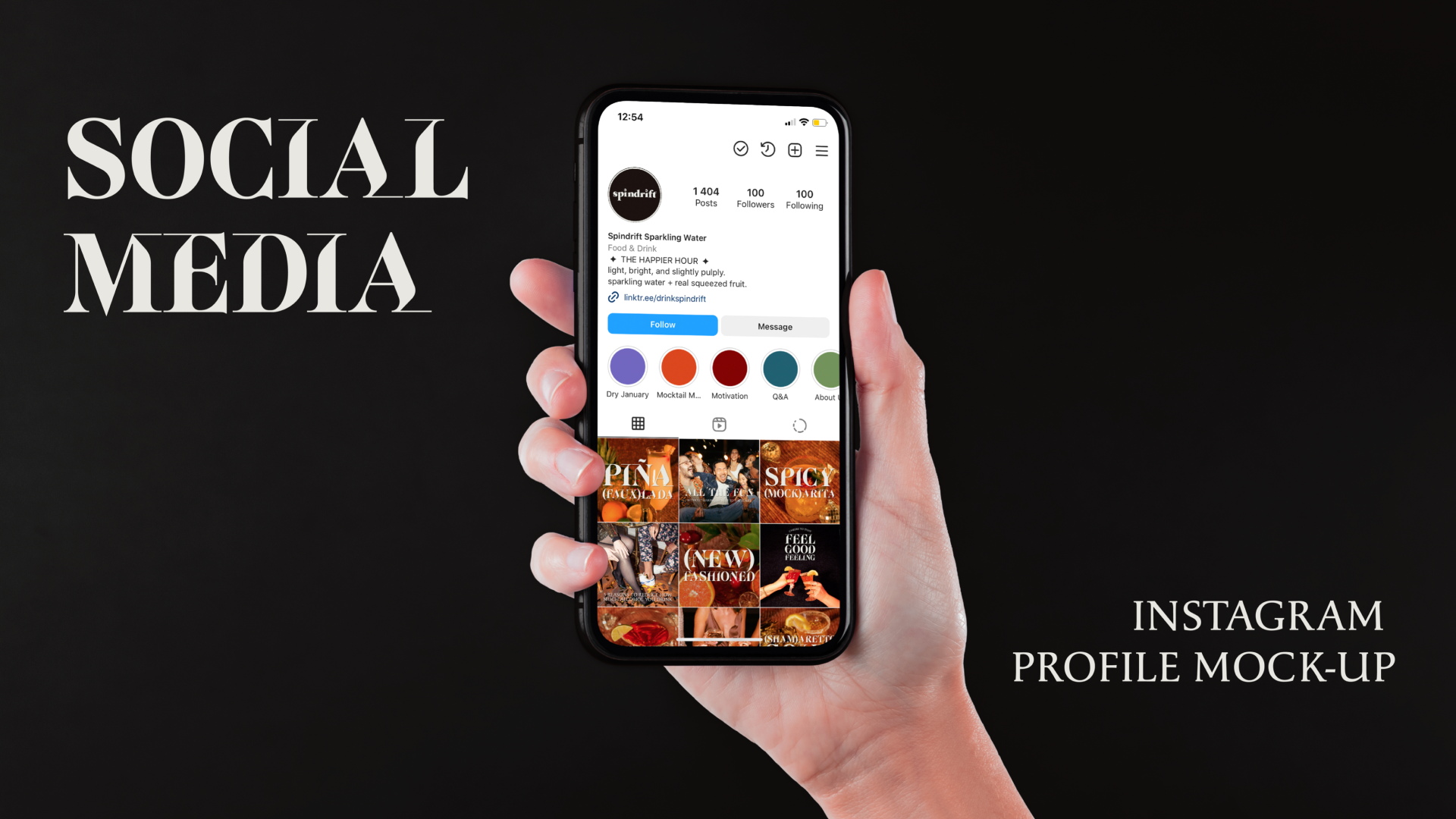
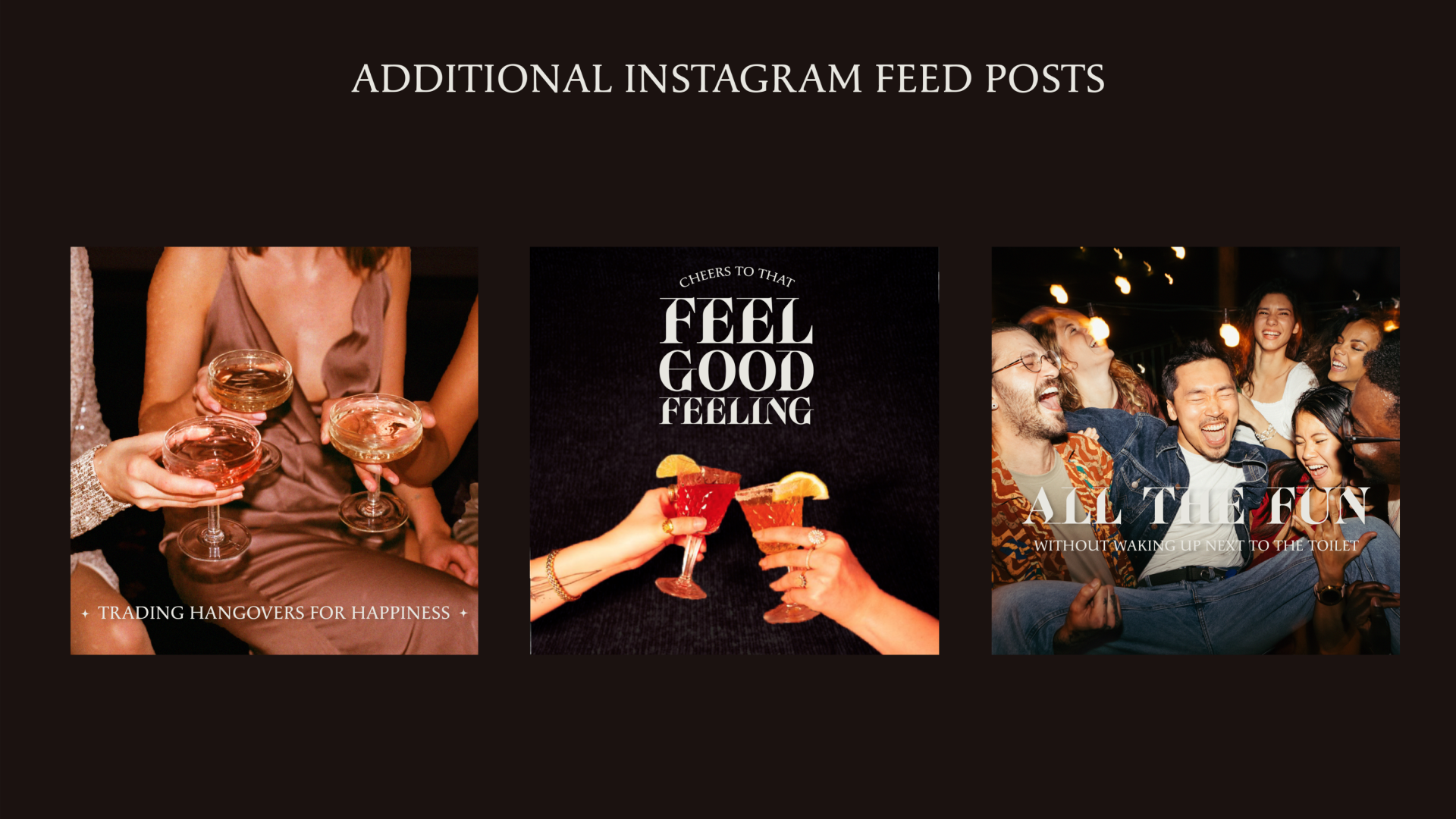
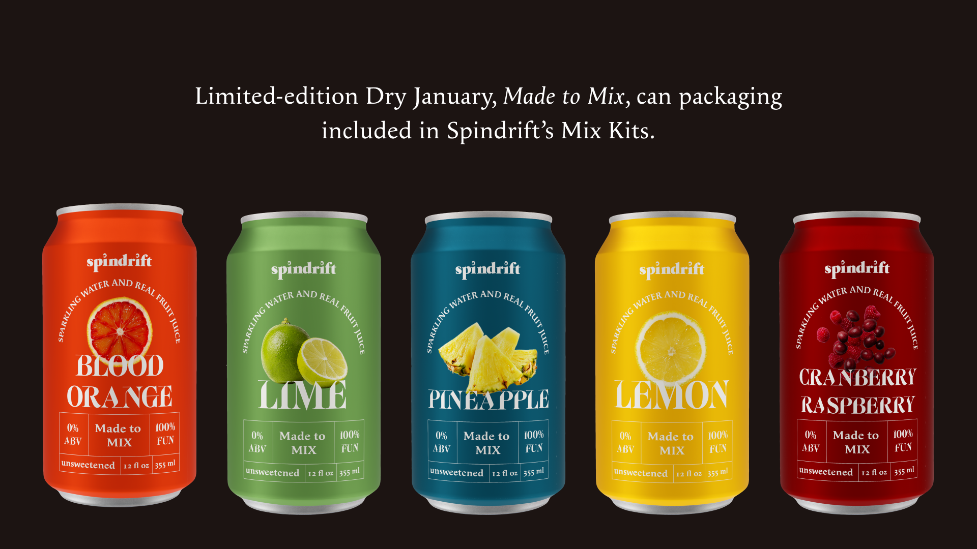
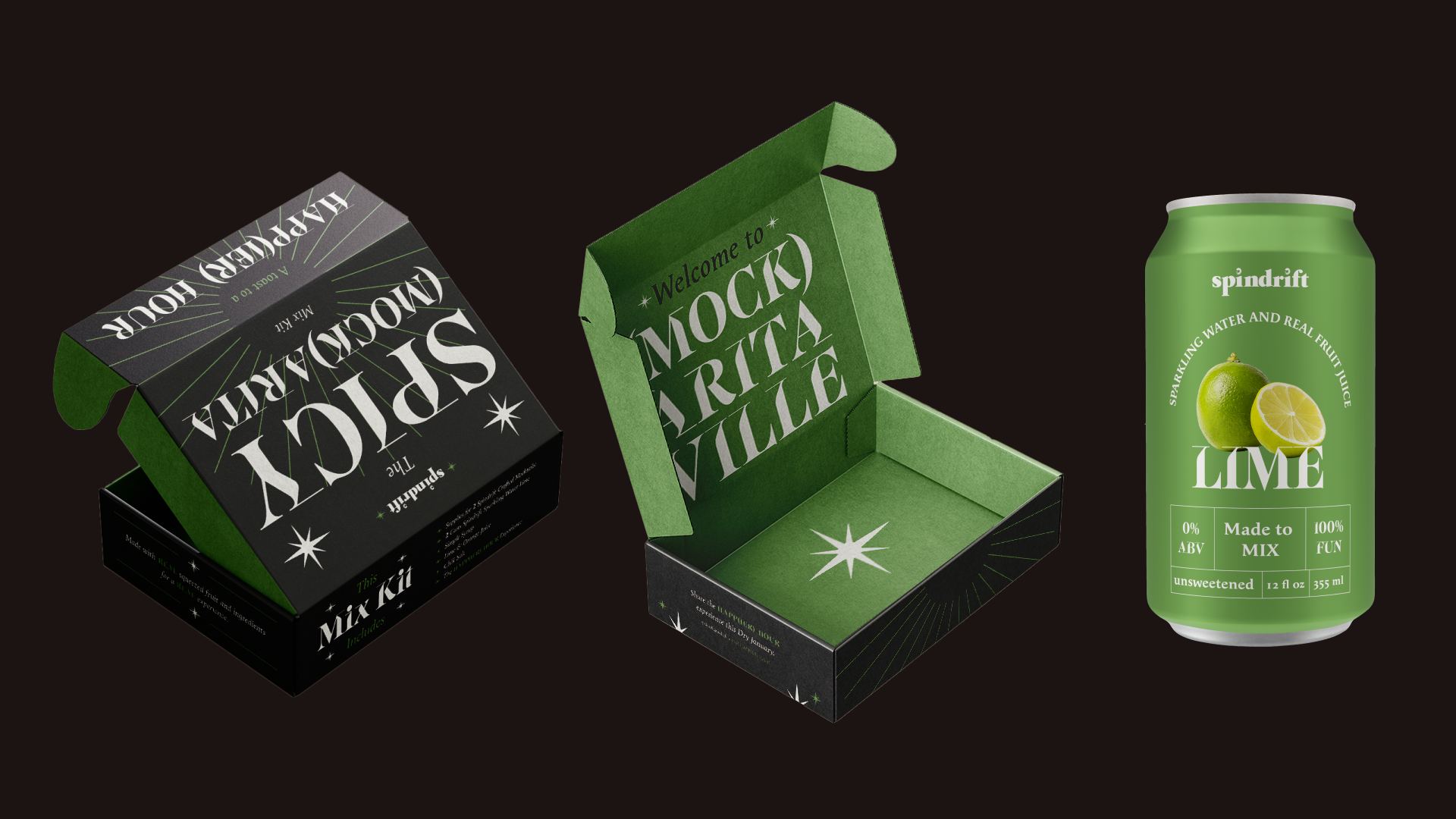
Spindrift is a sparkling water brand that focuses on their unique brand proposition that they use real fruit. We created a dry January brand take-over for Spindrift. For one month, they will carry newly packaged bottles, a mini-site and an instagram campaign that captures the idea of Dry January.
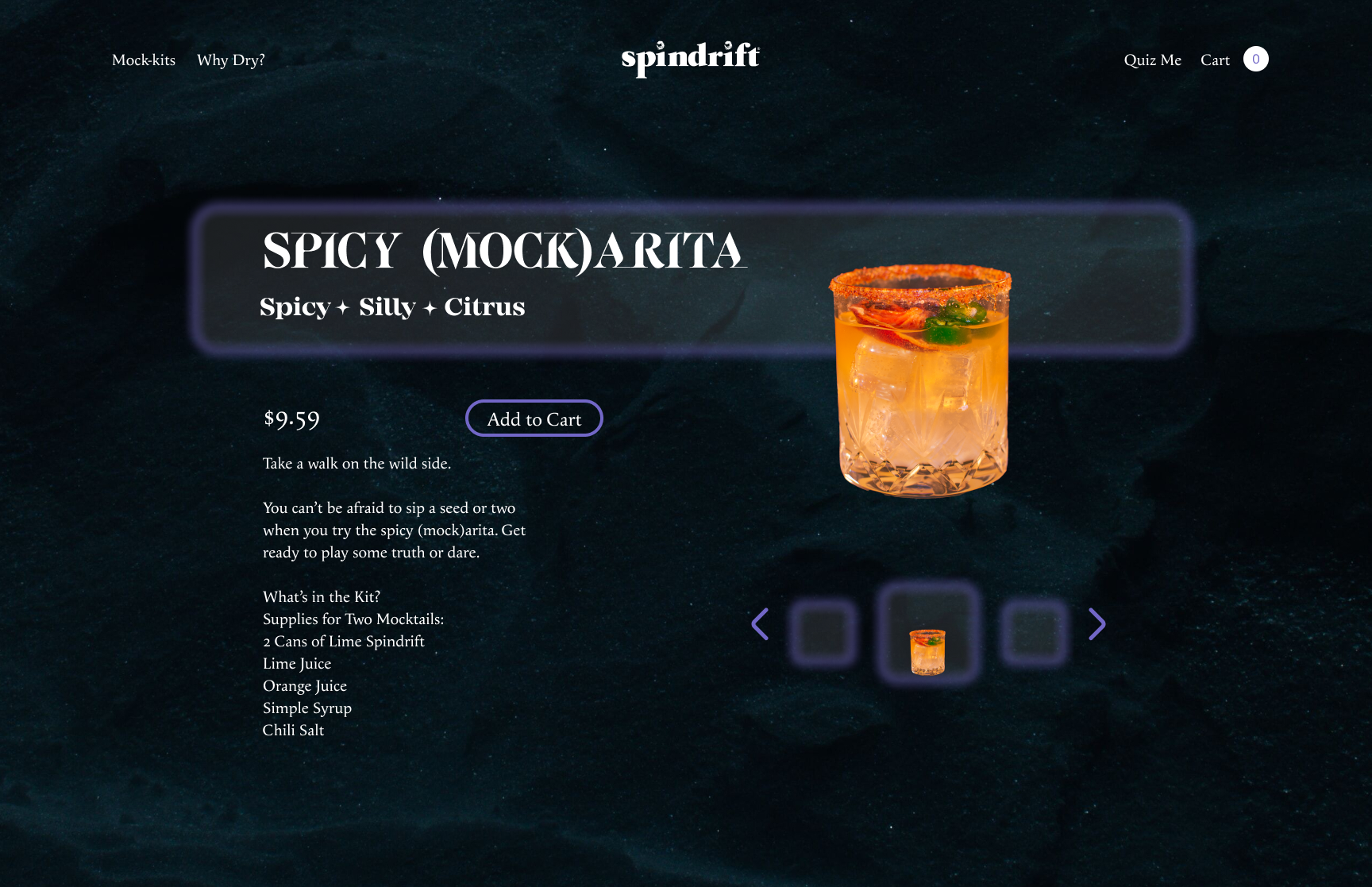
My role in this project was primarily in the web design, yet I had a hand in research, art direction and overall concept.
Tools
Figma, Illustrator, Adobe After Effects, Photoshop
Skills
Brand Design, UX/UI, Design Research, Art Direction
Duration
8-week brand research and design
Team
Farrah Nobles, Madi Fujawa, Aundrea Verti, Collin Morris, Jae Garcia
Overview
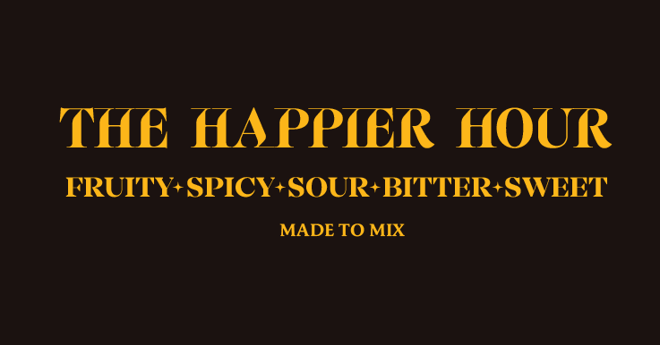
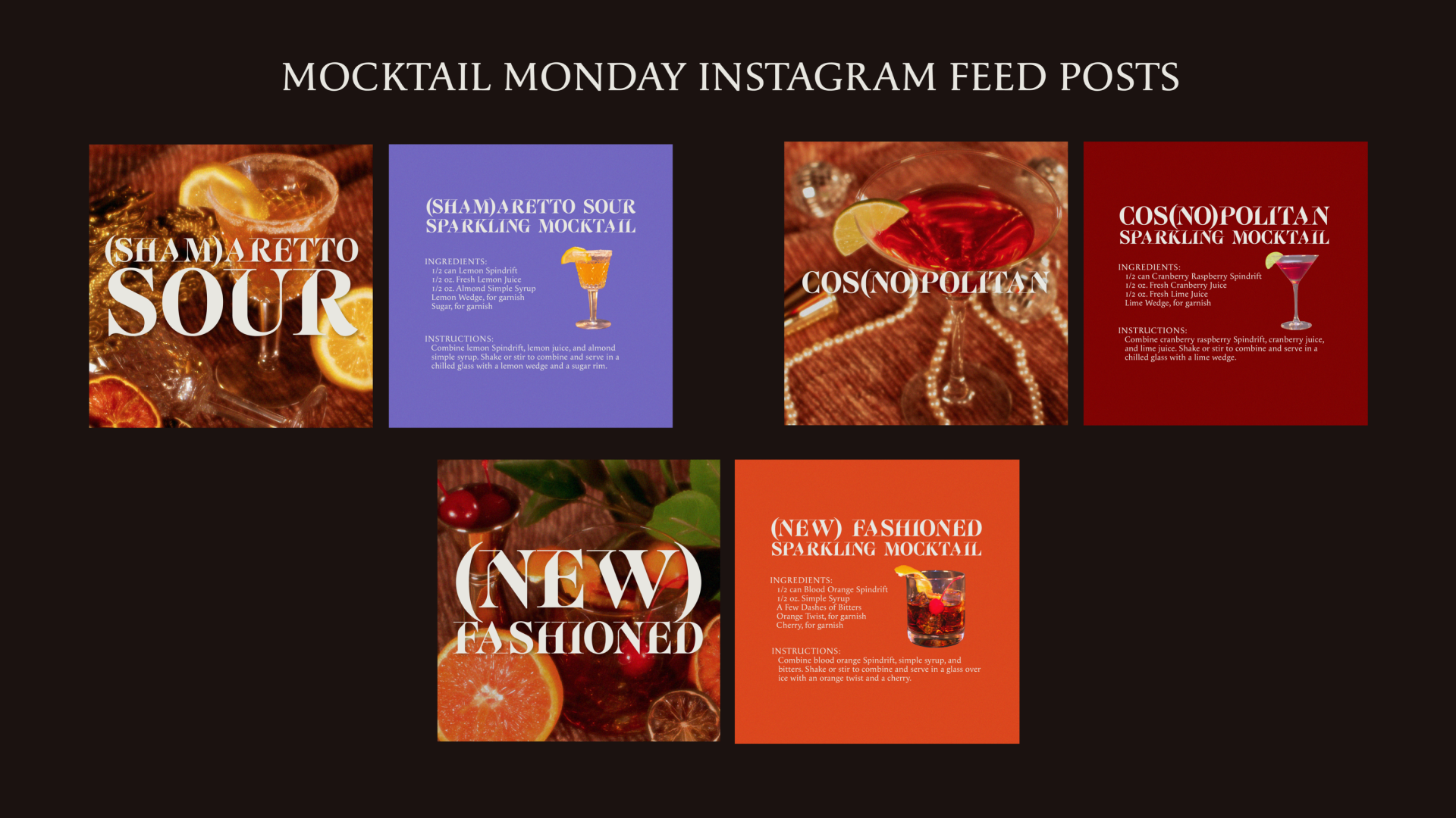
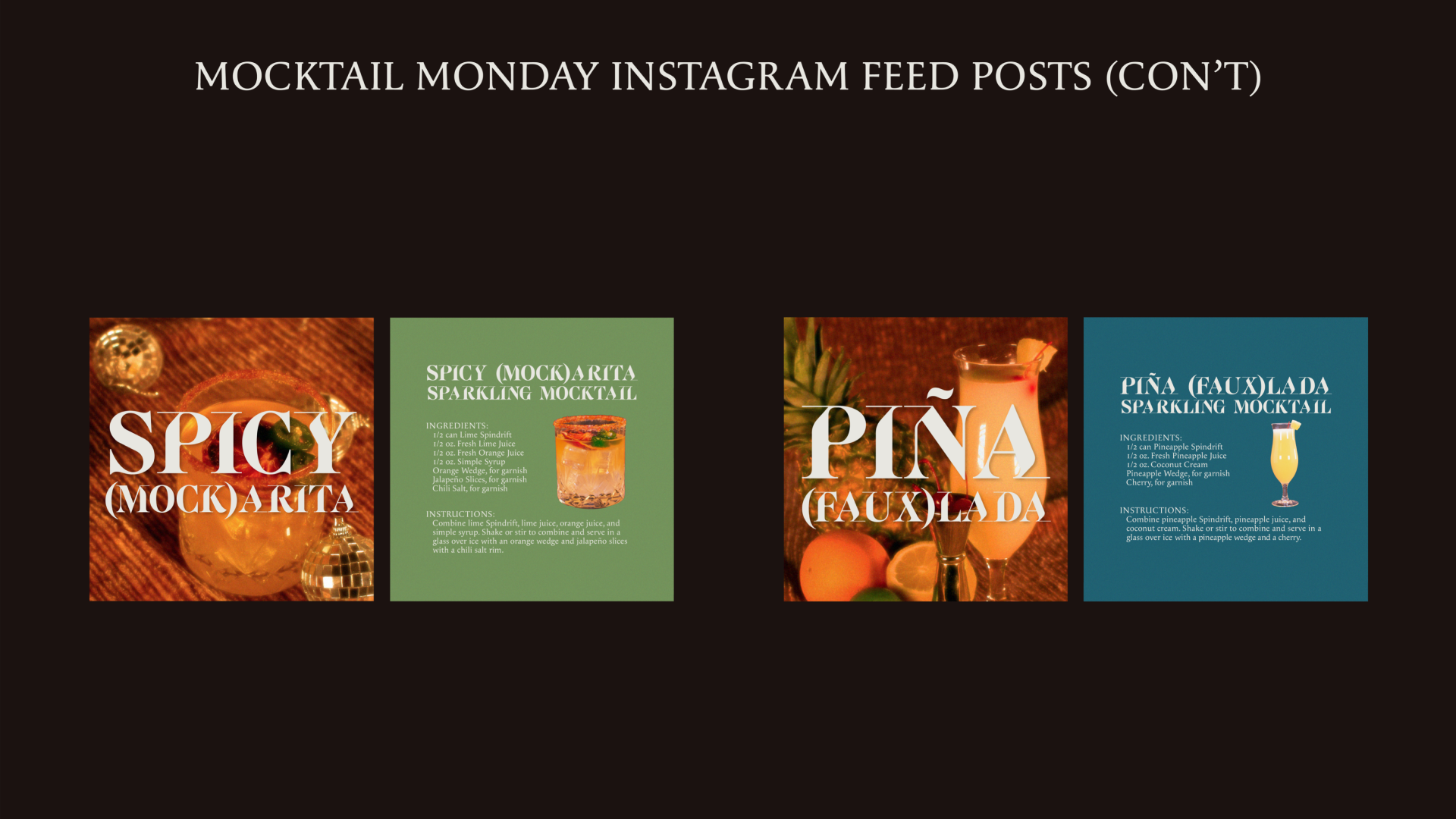
“The Happier Hour” is our tagline for this campaign. We dove deep into the world of mocktails, developing an elegant line of classic cocktails into world class mocktail kits. Each kit will contain everything that is needed to turn spindrift’s flavors into recipes you can use again long after dry January is over.
Objectives
Create a Dry January campaign that appeals to Spindrift’s target audience and attracts new users through an elegant, elevated look and feel.
Branding
Website
Home Page
Quiz
A playful quiz determines The user’s Dry Companion.
What I learned:
In this project, I coordinated a photoshoot for the first time, which was a lot of fun. It taught me a lot about planning in advance and lighting… mostly what I don’t know about lighting.
What I would do differently:
I wish i would’ve designed this website inside of adobe XD instead of figma, I wanted to add more animations that you cannot create inside of figma.
